In this section, we’re going to go over a few introductory techniques for visualizing and exploring a single cell dataset. This is an essential analysis step, and will tell us a lot about the nature of the data we’re working with. We’ll figure out things like:
- If the data exists on a trajectory, clusters, or a mix of both
- How many kinds of cells are likely present in a dataset
- If there are batch effects between samples
- If there are technical artifacts remaining after preprocessing
We’re going to use two main tools for this analysis: PCA and PHATE. PCA is useful because it’s quick and serves as a preliminary readout of what’s going on in a sample. However, PCA has many limitations as a visualization method because it can only recover linear combinations of genes. To get a better sense of the underlying structure of our dataset, we’ll use PHATE.
2.0 - What is a visualization?
Before we get too deep into showing a bunch of plots, I want to spend a little time discussing visualizations. Skip ahead if you want, but I think it’s important to understand what a visualization is, and what you can or cannot get from it.
A visualization is a reduction of dimensions
When we talk about data, we often consider the number of observations and the number of dimensions. In single cell RNA-seq, the number of observations is the number of cells in a dataset. In other words, this is the number of rows. The number of dimensions, or number of features, is the number of genes. These are the columns in a gene expression matrix.
In a common experiment you might have 15,000-30,000 genes in a dataset measured across 5,000-100,000 cells. This presents a problem: How do you visually inspect such a dataset? The key is to figure out a way how to draw the relationships between points on a 2-dimensional sheet of paper, or if you add linear perspective, you can squeeze in a third dimension.
A visualization is simply figuring out how to go from 30,000 dimensions -> 2-3.
Heatmaps allow you to look at all genes across all cells simultaneously
One way is to look at a heatmap. Here I’ve created a clustered heatmap from the Datlinger data using seaborn.clustermap:
import seaborn as sns
cg = sns.clustermap(t_cell_data, cmap='inferno', xticklabels=[], yticklabels=[])
cg.ax_heatmap.set_xlabel('Genes ({})'.format(t_cell_data.shape[1]))
cg.ax_heatmap.set_ylabel('Cells ({})'.format(t_cell_data.shape[0]))
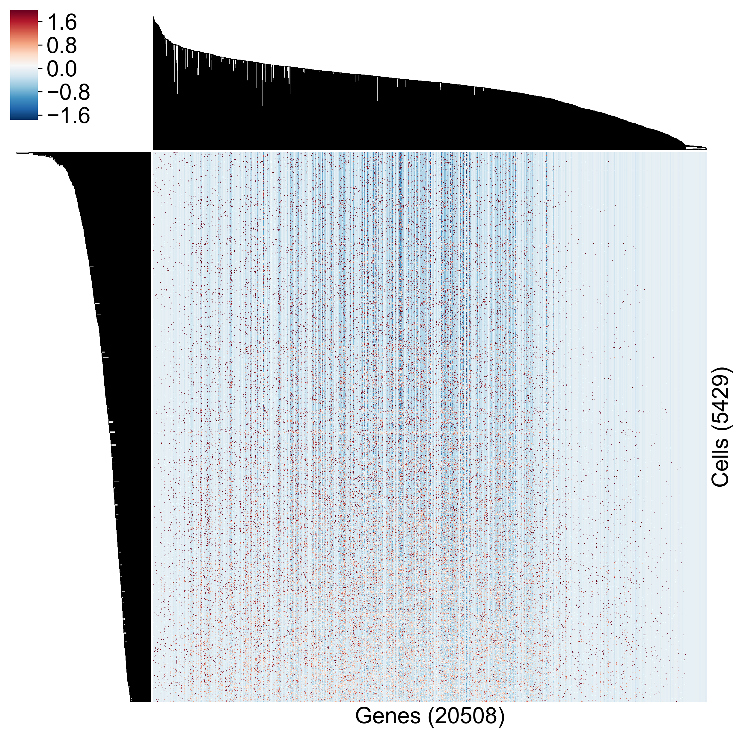
It’s hard to draw any conclusions from this. How close together are any two cells? How do genes covary? We get some sense of this, and we are getting to look at all genes across all cells, but this representation of the data hinders hypothesis generation.
Biplots show gene-gene relationships
Another natural presentation is the biplot, commonly used for FACS analysis. Here each axis represents the expression of one of two genes and each dot is a cell. Let’s look at a biplot for some genes from the Datlinger dataset.
As you can see, it’s much easier to identify gene-gene relationships, but you can see how complex a plot we get when we look at only a handful of genes. Now realize that there are 312 million pairwise combinations of genes in a 25,000 gene genome.
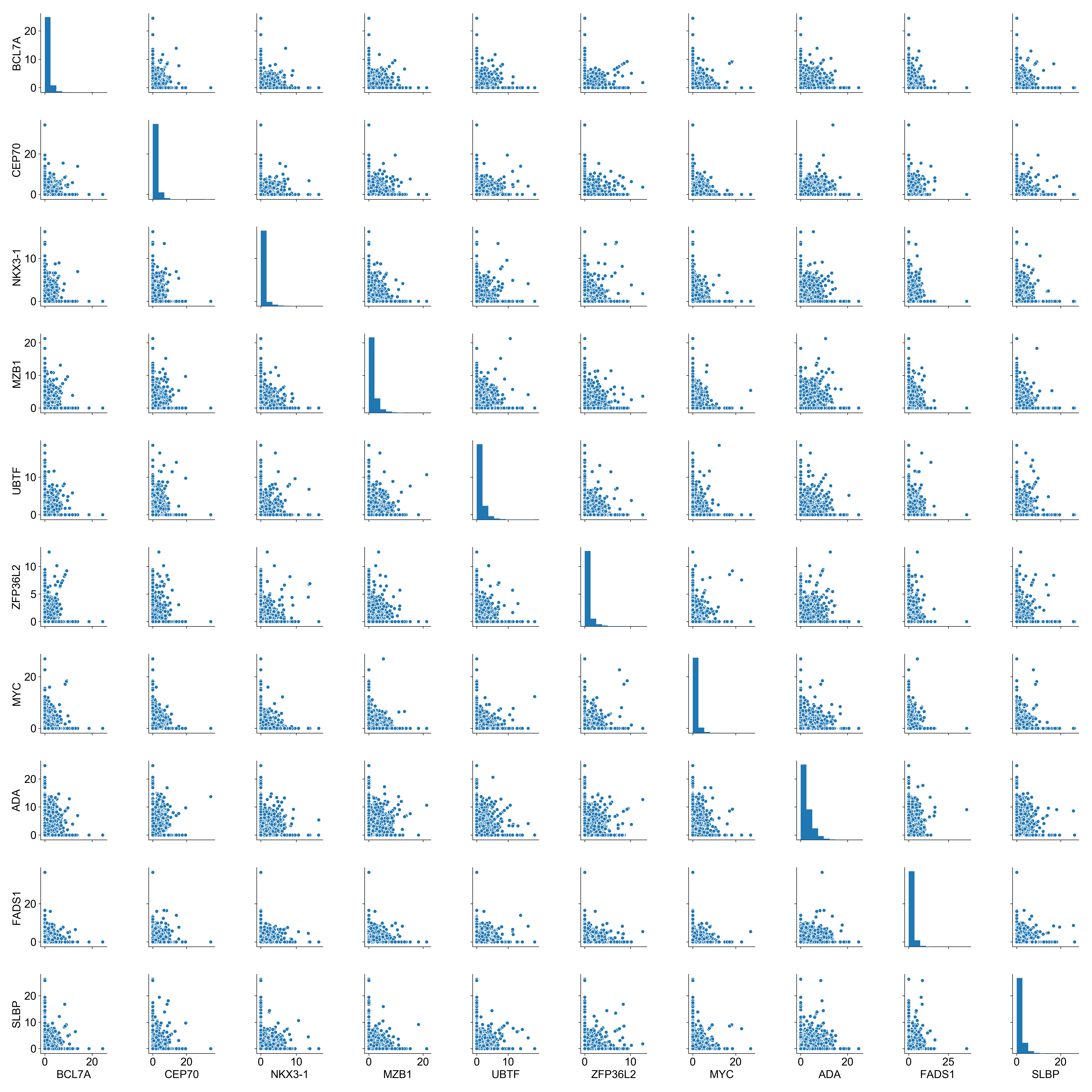
We need a better solution.
Why can we reduce dimensions?
In biological systems, we know that some genes are related to each other. These relationships are complex and nonlinear, but we do know that not all possible combinations of gene expression are valid.
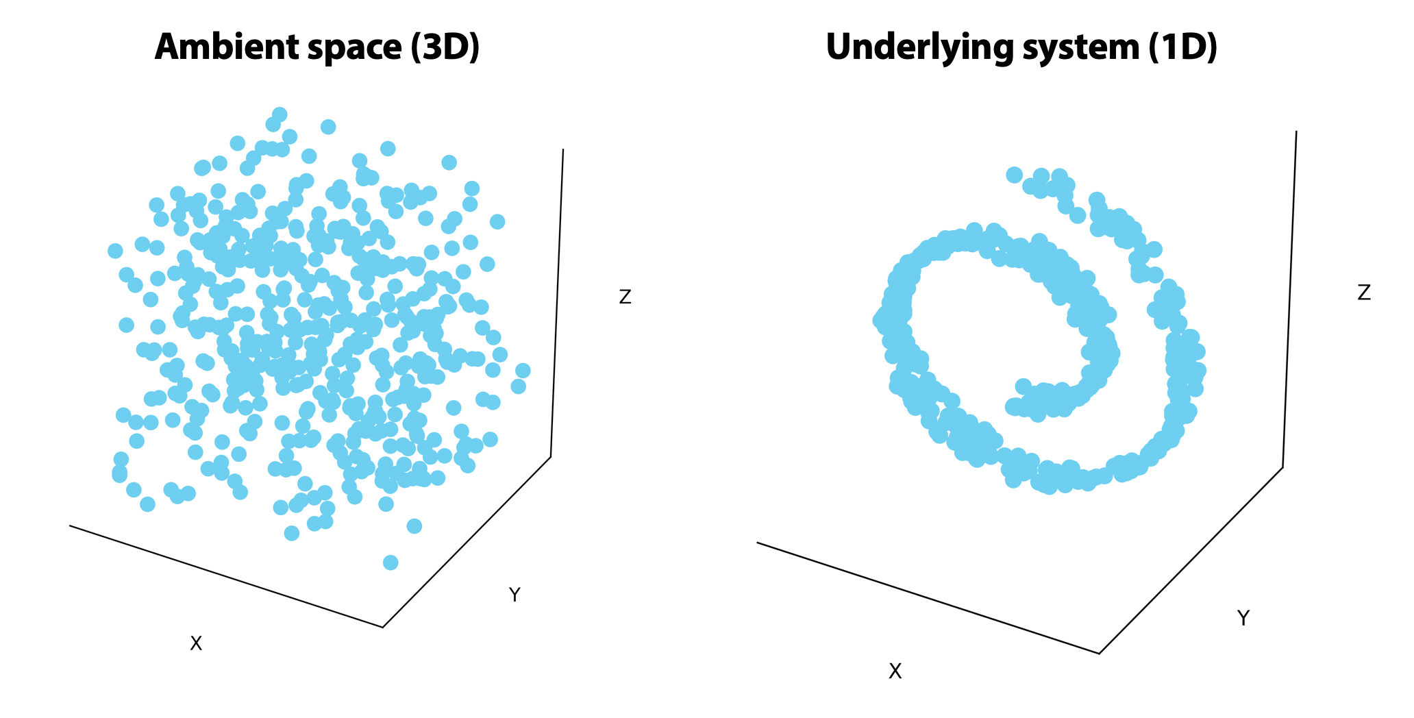
On the left, points are uniformly distributed in the ambient 3-dimensional space. On the right, the points are randomly distributed on a 1-dimensional line that rolls in on itself. If we could unroll this line on the right, we would only need one or two dimensions to visualize it.
How can we reduce dimensions?
There are many, many ways to visualize data. The most common ones are PCA, t-SNE, and MDS. Each of these has their own assumptions and simplifications they use to figure out an optimal 2D representation of high-dimensional data.
PCA identifies linear combinations of genes such that each combination (called a Principal Component) that explains the maximum variance. t-SNE is a convex optimization algorithm that tries to minimize the divergence between the neighborhood distances of points (the distance between points that are “close”) in the low-dimensional representation and original data space.
There are thousands of dimensionality reduction algorithms out there, and it’s important to understand that the drawbacks and benefits of each.
2.1 - Visualizing data using PCA
Why PCA?
I like to start out any scRNA-seq analysis by plotting a few principal components (PCs). First of all, we generally need to do PCA before doing any interesting downstream analysis, especially anything that involves graphs or matrices. Graphs are a mathematical representations of data as nodes and edges; more on that later.
Doing multiplication or inversion of matrices with 1,000+ dimensions gets very slow and takes up a lot of memory so we typically only store 100-500 PCs and use this for downstream analysis. PCA gives us a quantification of how much variance we’ve lost by removing some of the final principal components. This means we can figure out how many we need to capture 99.999% of the variance in a dataset.
Once we’ve calculated 100 PCs, we can just look at the first two to get a visualization.
PCA dimensionality reduction using scprep
By now you should know to expect that we’ve done the leg work here. You can easily perform PCA on any dataset using scprep.reduce.pca().
data_pcs = scprep.reduce.pca(data_sq, n_pca=100)
Now this simple syntax hides some complexity, so let’s dive a little deeper. If you don’t care, you can skip ahead to the “visualizing PCA section”.
Using the sklearn PCA operator
Scikit-learn (sklearn) is a machine learning toolkit for Python. It’s excellent. sklearn functions are the backbone of scprep, and we model our code to fit the sklearn style. The developers of sklearn published an interesting paper on ArXiv about how their code is structured. Ιf you’re a machine learning programmer using Python, I’d recommend reading it.
One of sklearn’s fundamental units is the estimator class. One extremely useful estimator is the PCA class.
You can instantiate a PCA operator in one line:
from sklearn.decomposition import PCA
pc_op = PCA()
And fitting it to data is just as easy:
data_pcs = pc_op.fit_transform(data_sq)
Here we’re fitting the estimator to the data (i.e. calculating the principal component loadings) and then transforming it (i.e. projecting each point on those components).
During fitting, information about the variance of each component is calculated and stores in the pc_op object as the explained_variance_ attribute. We can inspect this using a scree plot.
fig, ax = plt.subplots(1, figsize=(6,5))

# plot explained variance as a fraction of the total explained variance
ax.plot(pc_op.explained_variance_/pc_op.explained_variance_.sum())

# mark the 100th principal component
ax.axvline(100, c='k', linestyle='--')

ax.set_xlabel('PC index')
ax.set_ylabel('% explained variance')
ax.set_title('Scree plot')

fig.tight_layout()
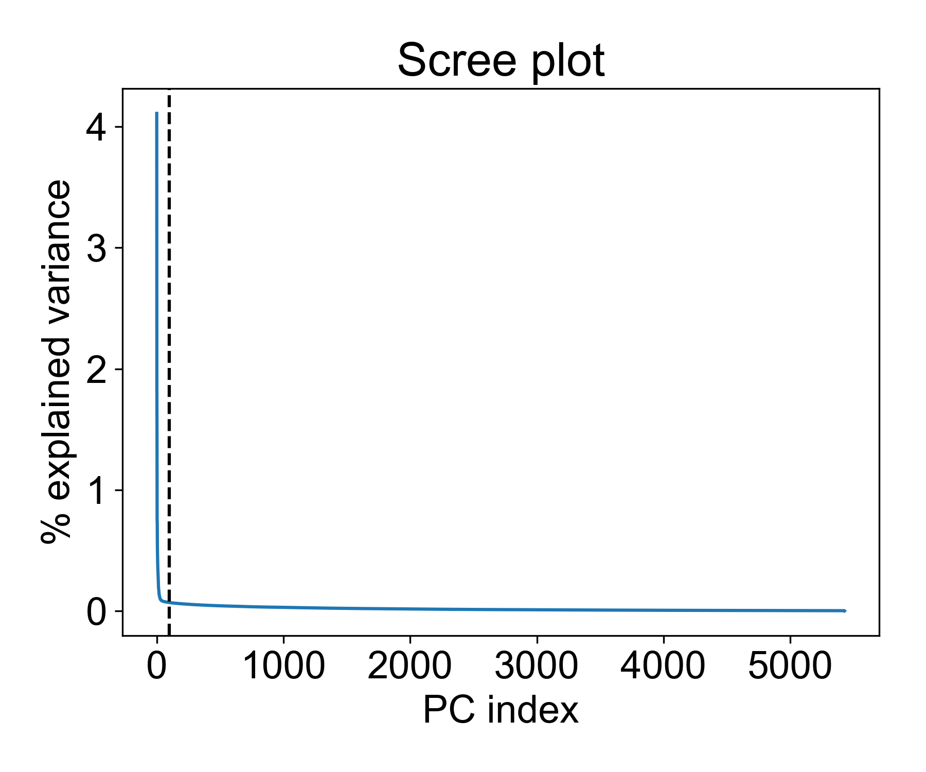
There are a few interesting things to note here. First, we see a distinct elbow point at around 50 PCs where the explained variance of each additional component drops significantly. This means that is we reduce the data to 100, 150, or 200 PCs, the marginal increase in explained variance is vanishingly smaller.
So is 100 a good cutoff? Let’s see how much variance is captured with this many components:
>>> pc_op.explained_variance_.cumsum()[100]/pc_op.explained_variance_.sum() * 100
20.333394141561936
This means we’re capturing ~20% of the variance in these components. Beyond this point, we get a decreasing return in explained variance for each added component.
How to show that adding components doesn’t increase useful information
2.2 Visualizing PCA for exploratory analysis
Now, I want to show why inspecting principal components is useful as a preliminary data analysis step. First, let’s consider the T-cell data from Datlinger et al.
fig, ax = plt.subplots(1, figsize=(5,5))

ax.scatter(data_pcs[:,0], data_pcs[:,1], s=1)
ax.set_xlabel('PC1')
ax.set_ylabel('PC2')
ax.set_title('T-cell - PCA')

fig.tight_layout()
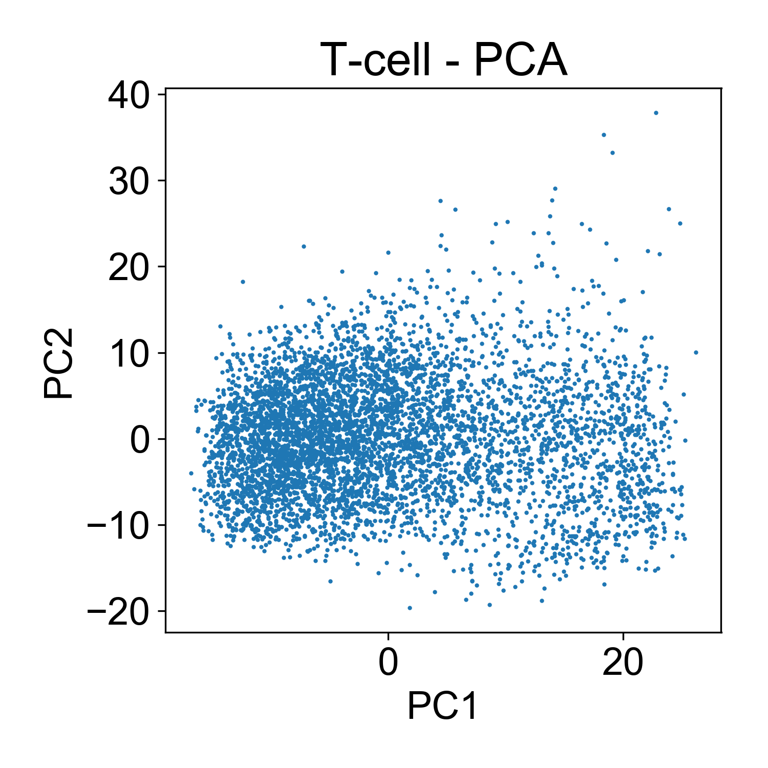
Here, each point here is a cells and the x and y axis represent the projection of that cell onto each principal component. Generally speaking, this PCA plot is unremarkable. There are a few outlier cells in the upper right with high PC2 loadings. Later we might want to look into what those cells, but for now its not so many that we’re very concerned about it.
To fully leverage the utility of PCA, let’s add a third dimension, color, to the plot. This way we can look at the distribution of library size, mitochondrial RNA, and cells from each sample.
First, let’s look at the conditions:
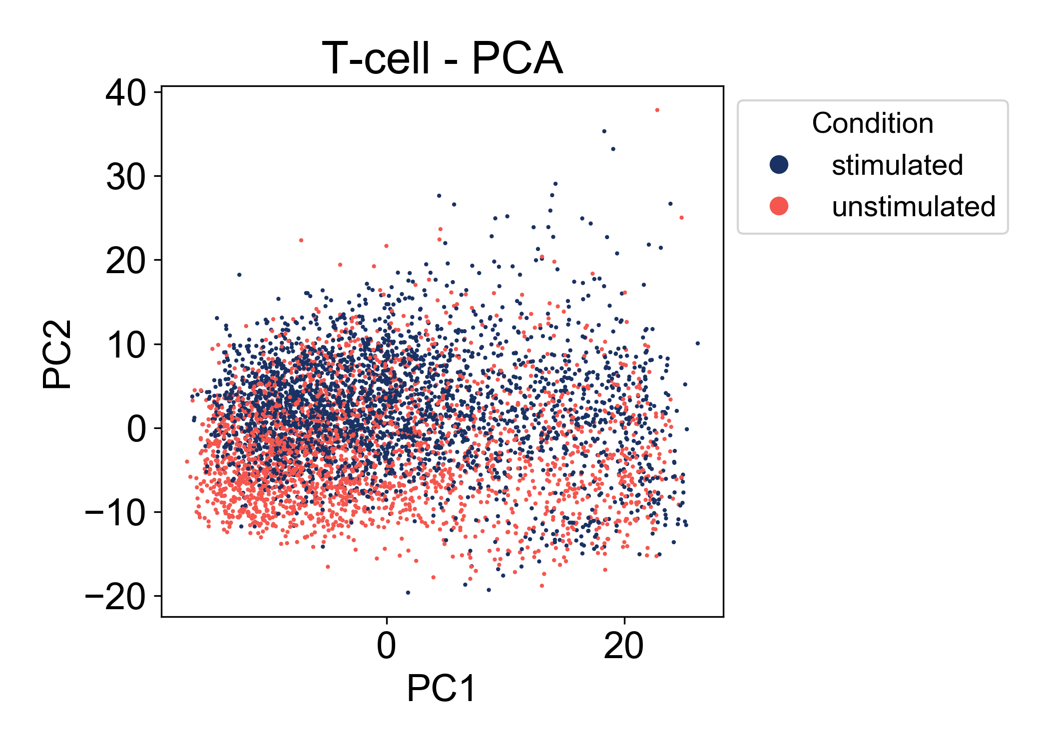
Here we can see that in the first two principal components, there is a good amount of overlap between the two conditions (stimulated and unstimulated). At this point, we can’t make many conclusions about the relationship between these conditions. We see that the range of cells states between samples is similar. We also observe that PC2 is associated somewhat with the condition label. Most importantly we don’t observe a batch effect separating the two samples.
2.3 Identifying batch effects using PCA
Compare the above plot to the following samples of mouse macrophage progenitors (unpublished). Here the first component visibily separates Sample 0 from Samples 1 & 2.
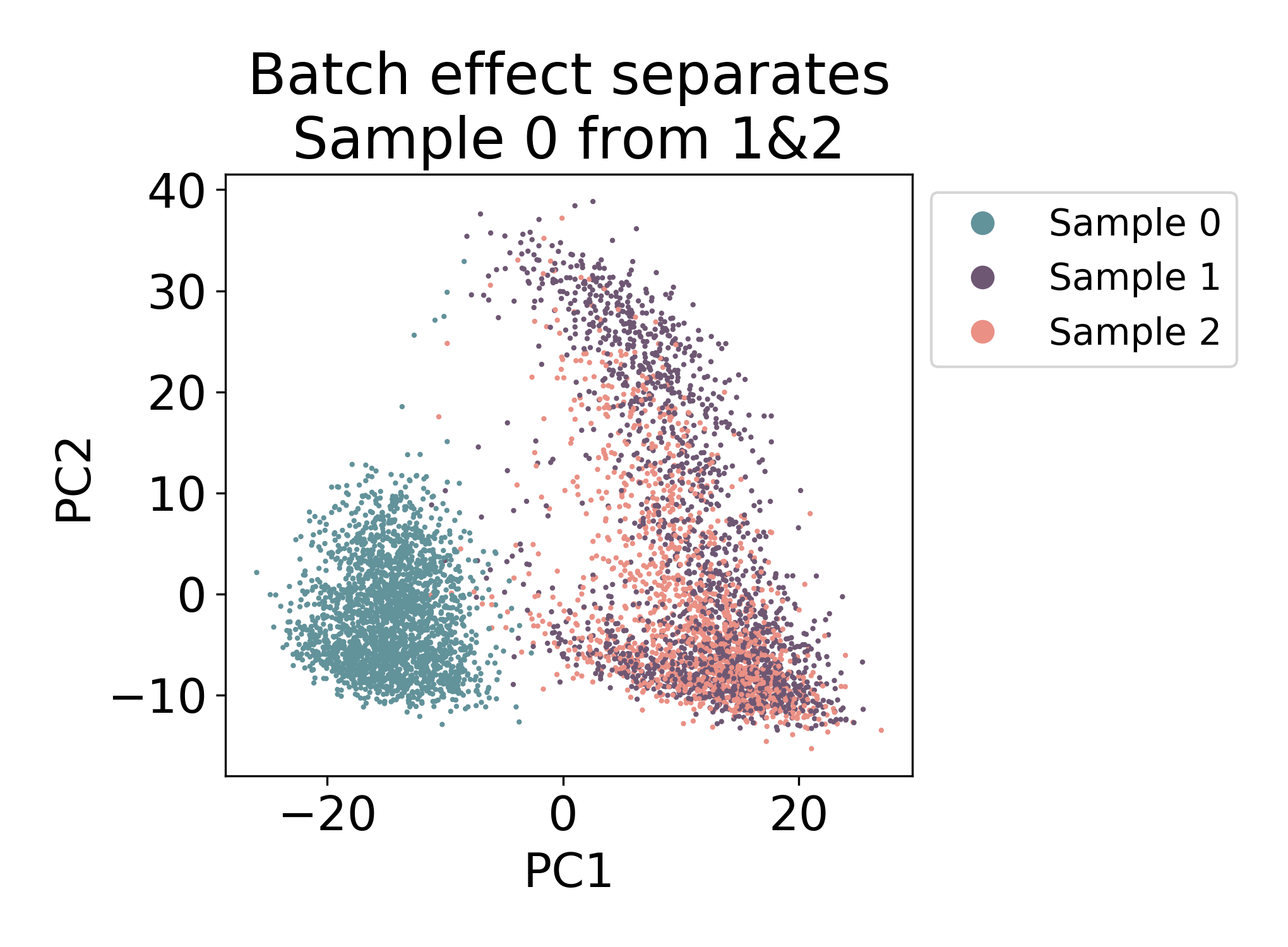
There is some mixing, but most of the cells in Sample 0 closest neighbors in the plot are all from the same sample. Compare this to Samples 1 & 2 where there are many cells from each sample that have both neighbors from Sample 1 and Sample 2.
In this dataset, we would say that there is some kind of batch effect between Sample 0 and Samples 1 & 2, but not between Samples 1 & 2. Note: I say batch effect here, but this does not mean that the shift is purely technical. In fact in this dataset, Sample 0 and Samples 1 & 2 are from different days of development.
2.4 When separation doesn’t imply batch effect
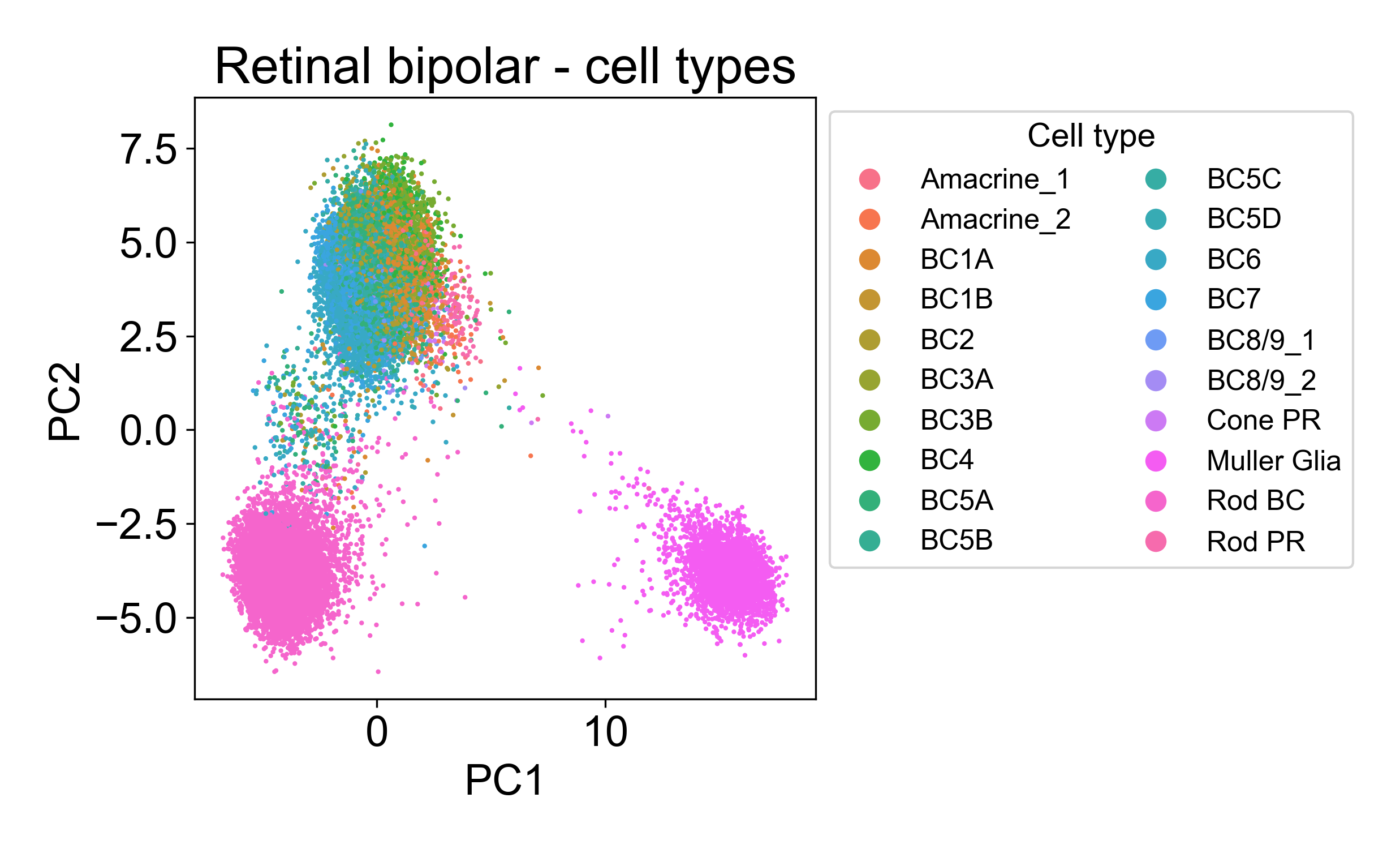
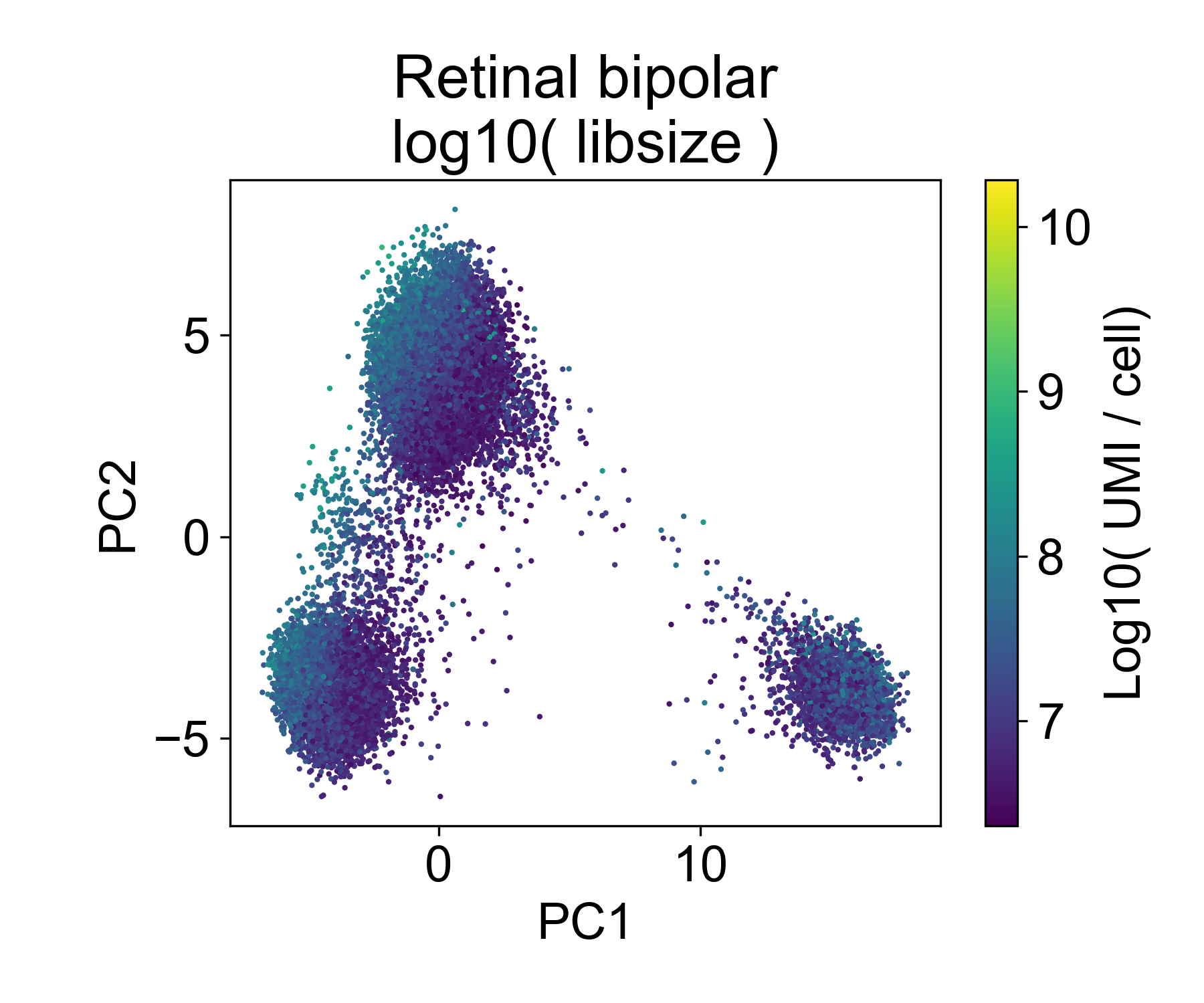
Let’s contrast this to a different dataset from from Shekhar, K. et al. (2018) Comprehensive Classification of Retinal Bipolar Neurons by Single-Cell Transcriptomics. Cell 166, 1308-1323.e30 (2016). Here, ~25,000 retinal bipolar cells were profiled using the Dropseq protocol. I picked this dataset because it profiles many different cell types from a terminally differentiated tissue, the adult mouse retina.
Here, we also see multiple groups of cells, but in each cloud there is approximately equal representation of each of 6 replicates.
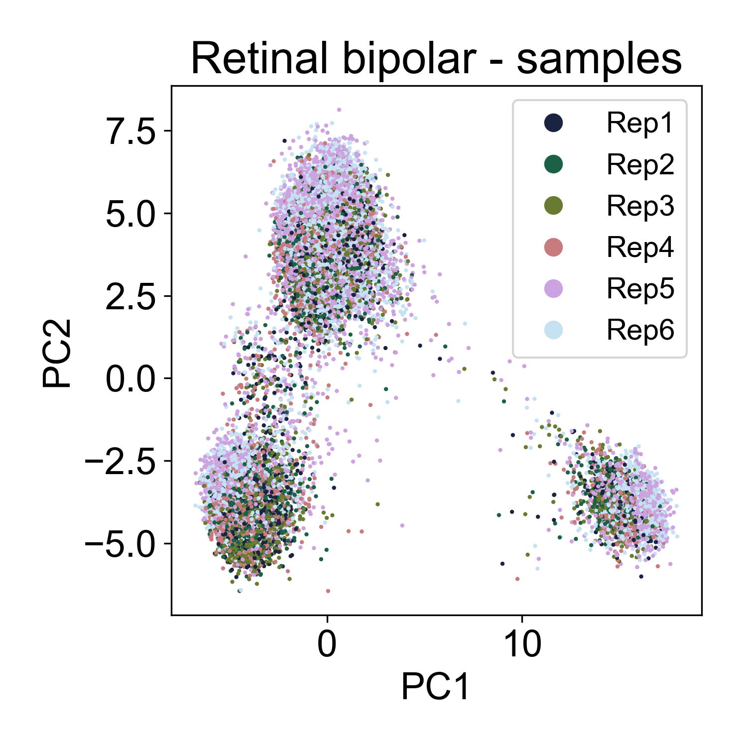
Rather, each cloud is associated with one or several annotated cell types from the paper.
2.5 PCA confirms ordering of samples in a timecourse
Finally, let’s consider samples from a single cell time course of human embryoid bodies (EBs) profiled in collaboration between our lab and the Ivanova laboratory at Yale. This dataset is described in the PHATE manuscript. This time course is a useful comparison to the Shekar Bipolar dataset because here we’re looking at a developing system that is also composed of many different lineages of stem, precursor, and progenitor cell types. This dataset is publicly available at Mendeley Data.
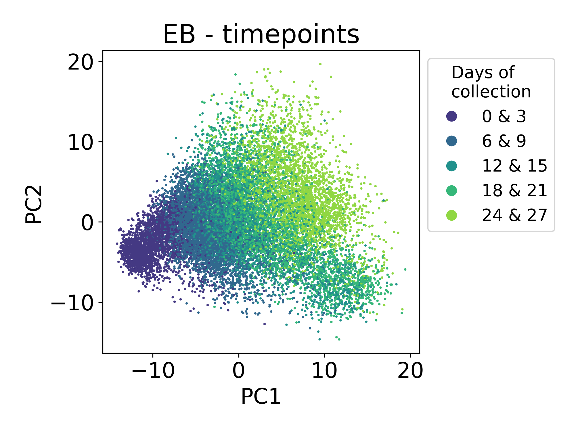
Here we can see that the first principal component is tracking with the time of collection for each sample. The ordering of these samples matches the ordering of developmental time. This is expected and encouraging.
2.6 Examining the distribution of library size
Now, let’s look at the library size.
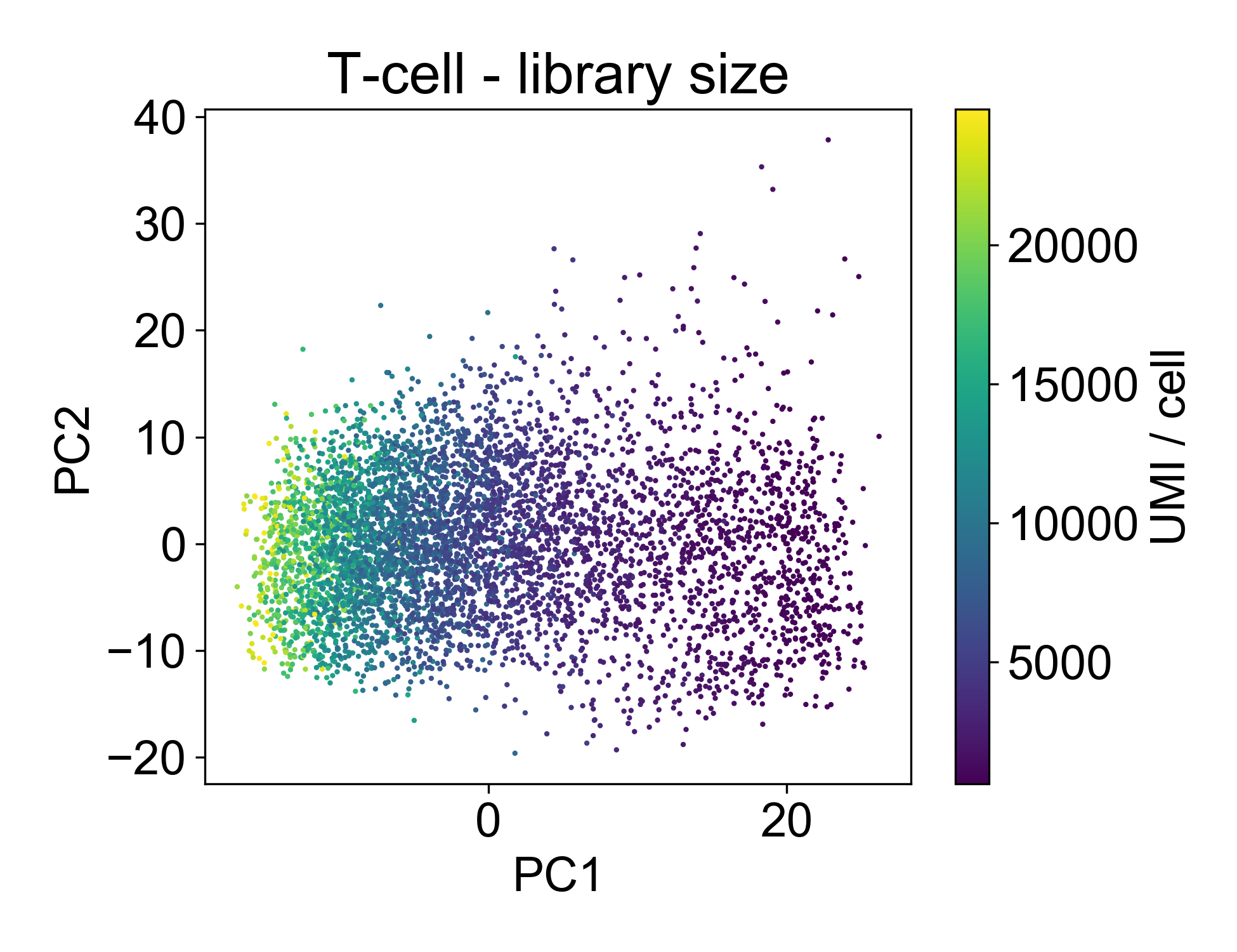
This plot shows us that PC1, the linear combination of genes with the highest variance, is strongly associated with library size. If we plot just those two factors, we can see the strength of that association.
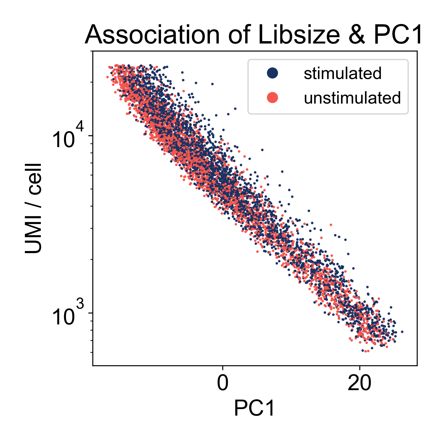
This shows us that the log-library size is generating most of the variance in the dataset. This indicates that we might want to filter on library size more stringently. However, this is not highly unusual. We can keep this information in our back pockets for now, and move on.
Now let’s look at the EB and retinal bipolar data:
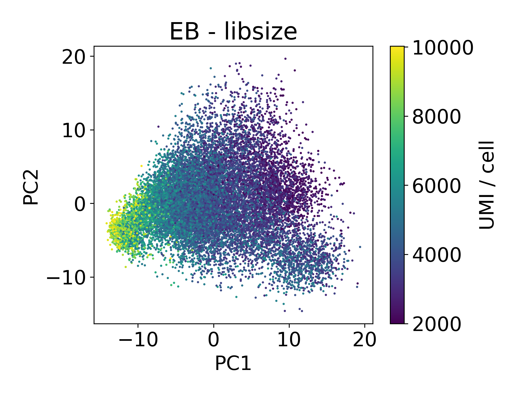
Again, we see a similar trend between PC1 and library size. However, this isn’t always the case.
In this dataset we can see that there are cells in each point cloud with high library size. Now you might wonder, when can we see that there’s an issue by looking at PCs and library size?
2.7 When principal components separate cells by library size
The following dataset is from a published paper comparing mutant and wild-type conditions. Inspecting the data via PCA clearly shows two populations of cells separated by PC1. Unlike the previous example of batch effect, these populations contain an equal number of cells from each sample. This leads us to refer to this artifact as a within-batch effect.
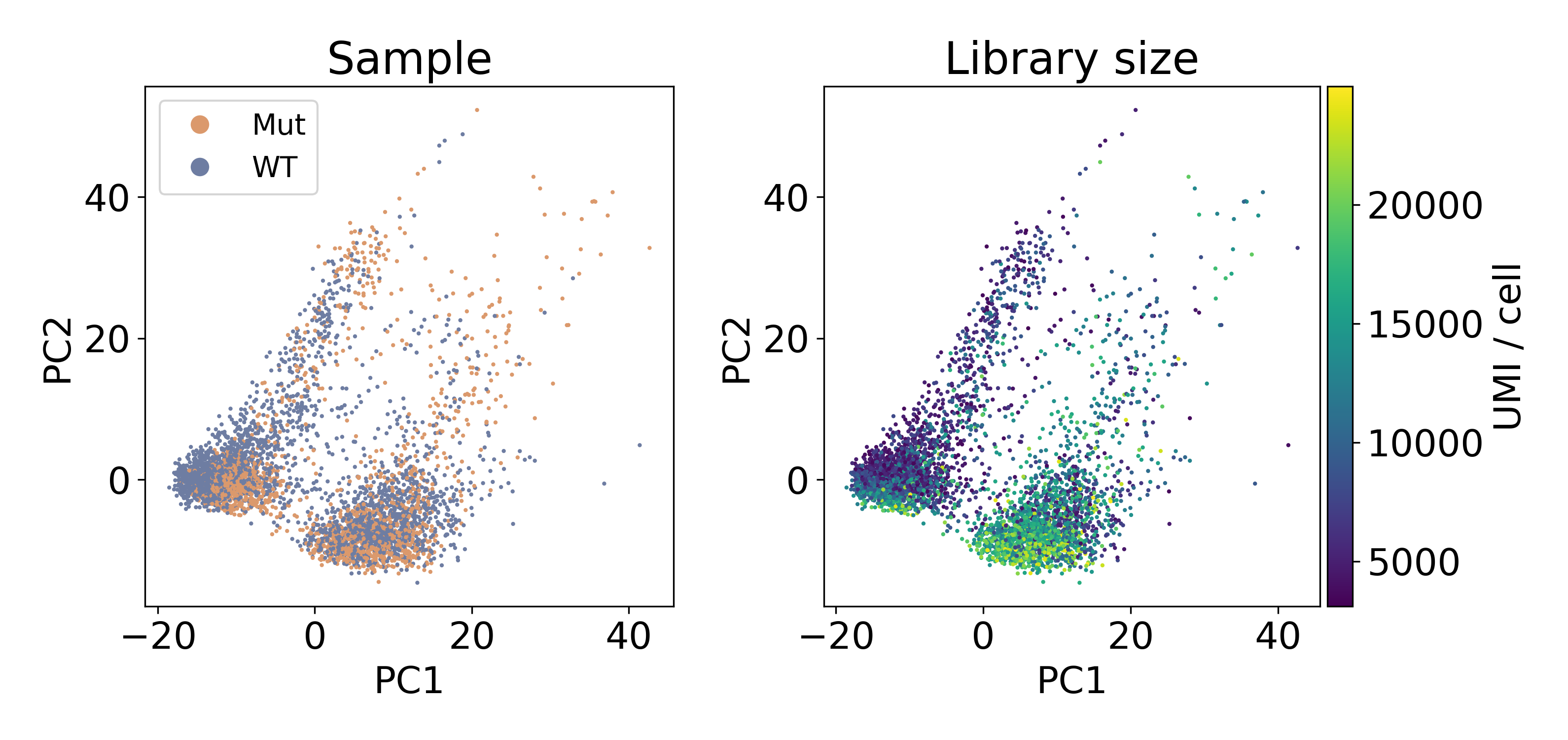
As you can see, the distribution of library sizes in the right populations is much higher than on the left. In the next plot, I did KMeans on the first 100 PCs to extract the clusters. We’ll discuss clustering more later, but this hack worked to separate the populations so that we could look at the library size.
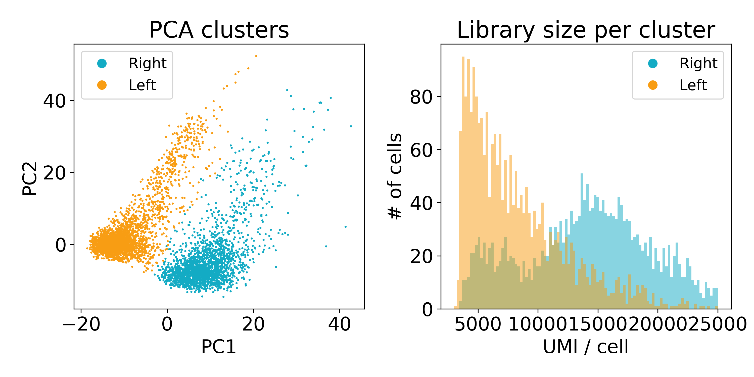
Now this experiment wasn’t performed in our lab or by one of our collaborators so we’re not entirely sure what’s going on here. One guess is that the cells on the left are of poor quality and have less RNA. Another is that they are from a different batch than those on the right. We’ve reached out to the original lab that created this data, and they seemed as stumped as we were.
At this point, you might seriously consider throwing out the cells with lower library size.
2.8 Examining mitochondrial RNA expression
I don’t want to spend too much time on this, but just as we looked at library size above, you should plot mitochondrial RNA expression on a PCA plot.
Generally, you want the mitochondrial expression to look something like this:
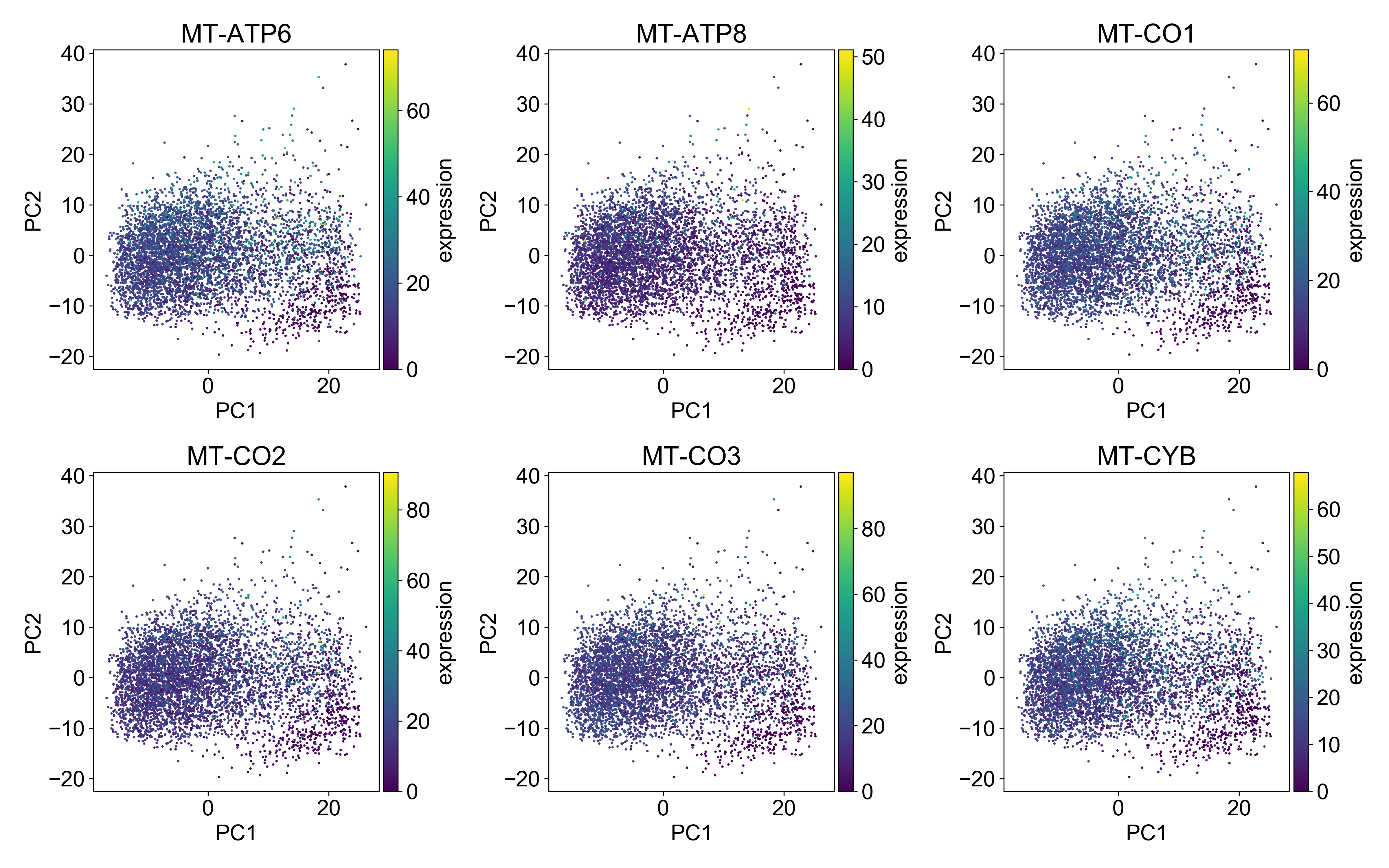
Here, the cells with the highest mitochondrial expression are generally evenly distributed on the plot. This is a good indication that you’ve done a good job filtering mitochondrial genes.