Once you’ve inspected the principle components of your dataset, it’s time to start visualizing your data using PHATE. We’re going to demonstrate PHATE analysis on a few datasets. We will show:
- How PHATE works
- Running PHATE on several datasets
- How to interpret a PHATE plot
- Clustering using the diffusion potential
- How to pick parameters for PHATE
- How to troubleshoot common issues with PHATE plots
3.0 - What is PHATE and why should you use it?
PHATE is a dimensionaltiy reduction developed by the Krishnaswamy lab for visualizing high-dimensional data. We use PHATE for every dataset the comes through the lab: scRNA-seq, CyTOF, gut microbiome profiles, SNP genotyping, simulated data, etc. PHATE was designed to handle noisy, non-linear relationships between data points. PHATE produces a low-dimensional representation that preserves both local and global structure in a dataset so that you can make generate hypotheses from the plot about the relationships between cells present in a dataset. Although PHATE has utility for analysis of many data modalities, we will focus on the application of PHATE for scRNA-seq analysis.
PHATE is inspired by diffusion maps (Coifman et al. 2008), but include several key innovations that make it possible to generate a two or three dimensional visualization that preserves continuous relationships between cells where they exist. For a full explanation of the PHATE algorithm, please consult the PHATE manuscript.
Installing PHATE
PHATE is available on PyPI, and can be installed by running the following command in a terminal:
$ pip install --user phate
PHATE is also available in MATLAB and R, but we’re going to focus on the Python implementation for this tutorial.
3.1 PHATE parameters
As we mentioned in the previous section, PHATE is a subclass of the sklearn.BaseEstimator, and it’s API matches that of the PCA operator. To use PHATE, you must first instantiate a phate.PHATE object, and then use fit_transform to build a graph to your data and reduce the dimensionality of the data for visualization.
PHATE has three key parameters:
n_components- sets the number of dimensions to which PHATE will reduce the input dataknn- sets the number of Nearest Neighbors to use for calculating the kernel bandwidthdecay- sets the rate of decay of the kernel tails
I’ll introduce other parameters thoughout the tutorial, but you should also check out the full documentation on readthedocs: https://phate.readthedocs.io/en/stable/.
3.2 Wait a second, what’s a kernel?
Now if you’ve never studied graph theory or discrete mathematics, these last two parameters might be confusing. To understand them, consider a very simple graph, the k-Nearest Neighbor (kNN) graph. Here, each cell is a node in the graph, and edges exist between a cell and it’s k nearest neighbors. You can also think about this as a graph where all cells are connected, but the connections between non-neighboring cells have a strength or weight of 0, while the edges between neighboring cells have a weight of 1.
The kNN graph offers a very powerful representation for single cell data, but it also has some drawbacks. For example, consider the following graphs:
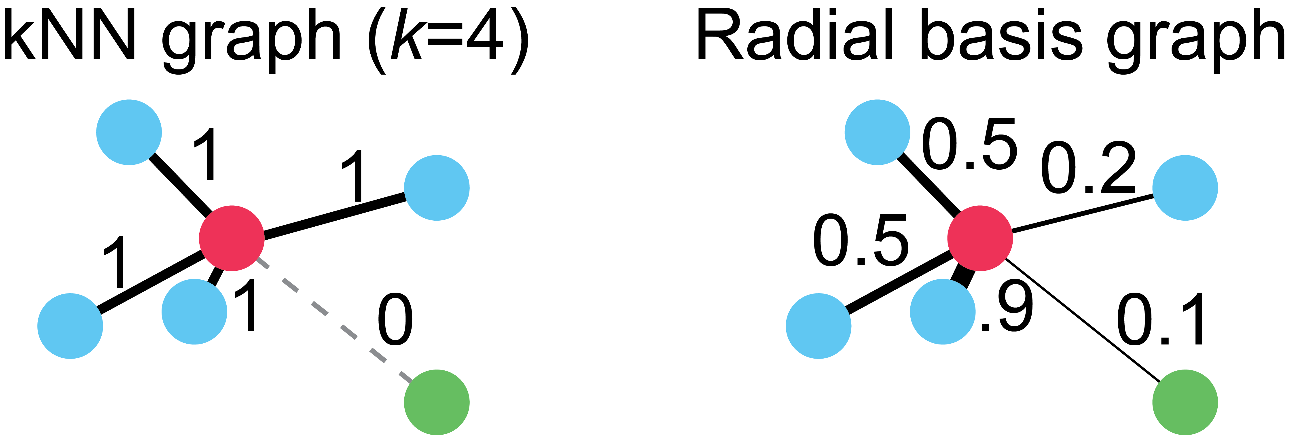
On the left, we have a kNN graph where k=4. Notice that all the blue cells, regardless of their proximity to the red cell, have edges of equal weight. Also notice that the green cell in the lower right hand corner has no connection to the red cell, despite being only trivially farther away than the next closest cell. These two properties of kNN graphs, a harsh cutoff for edges and uniform edge weights, means that choice of proper k is critical for any method using this graph.
To overcome these limitations, we use a variation of the radial basis kernel graph on the right. This graph connects cells with edge weights proportionally to their distance to the red cell. You can think of this kernel function as a “soft” kNN, where the weights vary smoothly between 0 and 1. Note: in practice, all cells are connected at one stage during graph instantiation, but then edges that are below a cutoff, such as 1e-4 are set to 0.
Now that you understand this distinction, you can think of the knn parameter as setting a baseline for finding close cells, and decay as the “softness” the edge weighting.
3.3 Instantiating a PHATE estimator
In practice, I usually start by running PHATE on a new dataset with default parameters, which is n_components=2, knn=5, and decay=40. Rarely, I will want to change these, but we will cover parameter tuning in a later section.
We can create a new PHATE object just like we did with the PCA class:
import phate
phate_op = phate.PHATE()
and now we can generate an embedding by calling fit_transform and plot the output using scprep.plot.scatter2d. Let’s start with the T cell data from Datlinger et al. (2017).
Y = phate_op.fit_transform(data_sq)
Note: you can also pass in the PCA-reduced data from earlier, but PHATE can also do this for you at the cost of increased compute time.
You’ll see some output that looks like this, telling you that PHATE is doing stuff:
Calculating PHATE...
  Calculating graph and diffusion operator...
    Calculating PCA...
    Calculated PCA in 4.20 seconds.
    Calculating KNN search...
    Calculated KNN search in 1.23 seconds.
    Calculating affinities...
    Calculated affinities in 0.18 seconds.
  Calculated graph and diffusion operator in 6.20 seconds.
  Calculating landmark operator...
    Calculating SVD...
    Calculated SVD in 0.51 seconds.
    Calculating KMeans...
    Calculated KMeans in 14.68 seconds.
  Calculated landmark operator in 16.57 seconds.
  Calculating optimal t...
    Automatically selected t = 28
  Calculated optimal t in 0.80 seconds.
  Calculating diffusion potential...
  Calculated diffusion potential in 0.45 seconds.
  Calculating metric MDS...
  Calculated metric MDS in 33.45 seconds.
Calculated PHATE in 57.48 seconds.
Note, these times with setting n_jobs=16, you may find slower performance on a laptop or when using sparse input.
3.4 Plotting PHATE with a scatter plot
Now we can plot using scatter2d:
scprep.plot.scatter2d(Y, ticks=None, label_prefix='PHATE', figsize=(5,5))
And see the following plot:
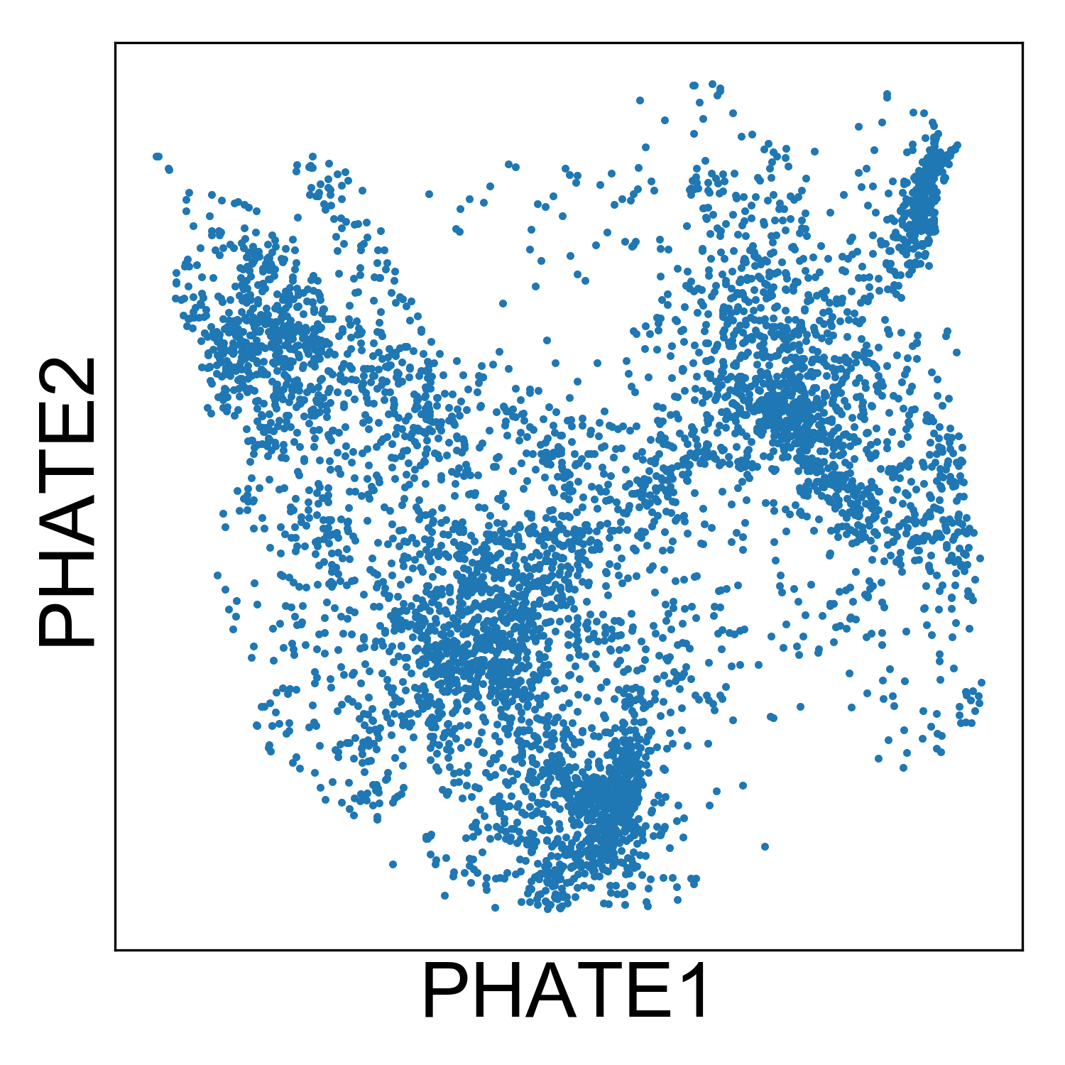
From this plot, we can tell that there are several kinds of cells in the data set, but it’s hard to tell much other than that without starting to add some color. Let’s plot the condition label for each cell, the library size, and expression of a mitochonrial gene.
# Plotting mitochondrial expression
fig, ax = plt.subplots(1, figsize=(3.4,3))
scprep.plot.scatter2d(Y, ax=ax, c=t_cell_data_ln['MT-CO1'],
                      title='MT-CO1', ticks=False, label_prefix='PHATE')
fig.tight_layout()

# Plotting libsize
fig, ax = plt.subplots(1, figsize=(3.6,3))
scprep.plot.scatter2d(Y, ax=ax, c=metadata['library_size'],
                      title='Library Size', ticks=False, label_prefix='PHATE')
fig.tight_layout()

# Plotting condition label
fig, ax = plt.subplots(1, figsize=(4.4,3))
condition_cdict = {'stimulated':'#1a3263',
                   'unstimulated':'#f5564e'}
scprep.plot.scatter2d(Y, ax=ax, c=metadata['condition'], cmap=condition_cdict,
                      title='Condition', ticks=False, label_prefix='PHATE',
                     legend_anchor=(1,1))
fig.tight_layout()
And we see the following plots:
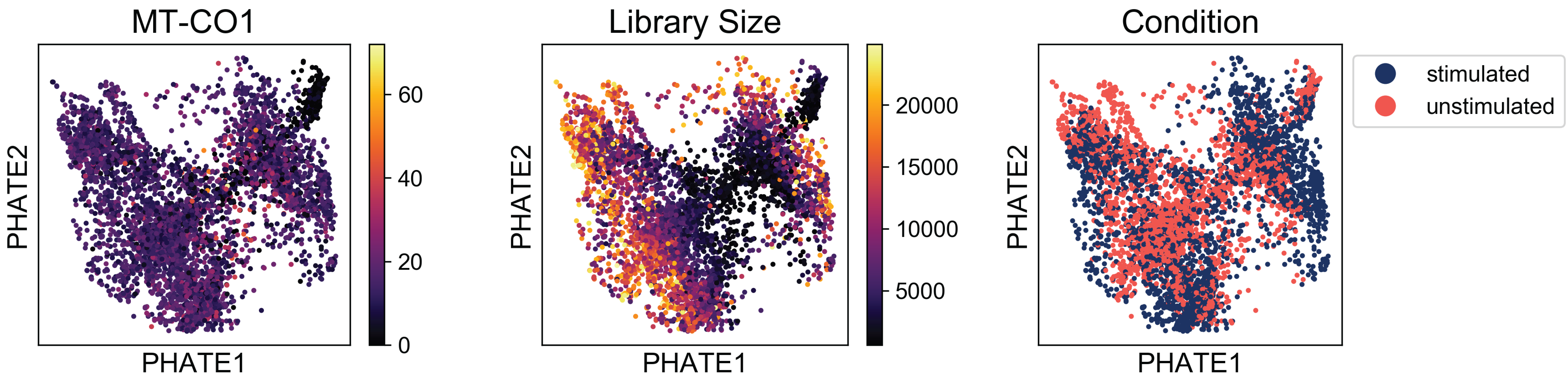
Examining these plots, we see that there are no regions enriched for high mitochondrial RNA (which would indicate apoptotic cells). Although there are some regions of the plot with higher library size than others, these cells are fairly well distributed over the plot. If we say a branch of cells shooting off the plot with very high or low library sizes, then we might want to revisit the filtering thresholds established during preprocessing.
Finally, when we examine the the distribution of condition labels, we see that there is a good amount of overlap between the two conditions. We’ll get to characterizing the differences between these two conditions in a later tutorial. For now, check out our method, MELD (Manifold Enhancement of Latent Dimensions) on BioRxiv (doi: 10.1101/532846).
3.5 Plotting PHATE as a KDE plot
Scatter plots are a useful way to display data. They also have the appeal of showing you every single point in your dataset. Or do they?
Scatter plots have one drawback, which is that data points that are overlapping in the plot get drawn on top of each other. This makes it difficult to identify where most of the data density lies. You could color your plot by a density estimate, as is commonly done in FACS analysis. However, I find that in these plots, the eye is still drawn to outliers.
Instead, I think it’s useful to look at a Kernel Density Estimate (KDE) plot. These plots use kernel functions (just like in the graph building process) to estimate data density in one or more dimensions.
In python you can make a KDE plot using the seaborn package. seaborn works seamlessly with numpy and pandas and uses matplotlib as a backend. The function for drawing a KDE plot is called, unsurprisingly kdeplot.
Let’s generate a KDE plot of the T cell data to get an idea of how many clusters of cells are in the data.
import seaborn as sns

fig, ax = plt.subplots(1, figsize=(4,4))
sns.kdeplot(Y[:,0], Y[:,1], n_levels=100, shade=True, cmap='inferno', zorder=0, ax=ax)

ax.set_xticks([])
ax.set_yticks([])

ax.set_xlabel('PHATE 1', fontsize=18)
ax.set_ylabel('PHATE 2', fontsize=18)

ax.set_title('KDE - T cells', fontsize=20)

fig.tight_layout()
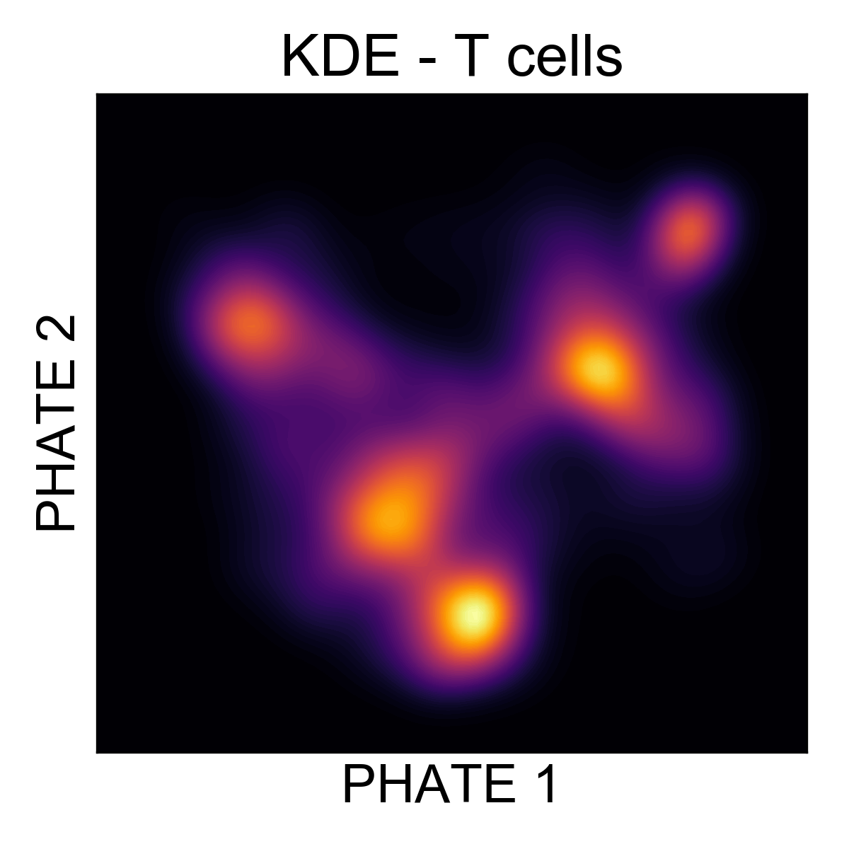
Here, it’s much easier to see that there are around 5 regions of density in the data. Let’s cluster them and figure out what they are!
3.6 Clustering data using PHATE
A common mode of analysis for scRNA-seq is to identify clusters of cells and characterize the transcriptional diversity of these subpopulations. There are many clustering algorithms out there, and many of them have implementations in sklearn.cluster. One of our favorite clustering algorithms is Spectral Clustering. In the PHATE package, we have developed an adaptation of this method using the PHATE diffusion potential instead of the eigenvectors of the normalized Laplacian.
You can call this method with phate.cluster.kmeans, and use these labels to color the PHATE plot. We’ll set k=5 based on our examination of the KDE plot.
clusters = phate.cluster.kmeans(phate_op, k=5)

scprep.plot.scatter2d(Y, c=clusters, cmap=sns.husl_palette(5), s=1,
                      figsize=(4.3,4), ticks=None, label_prefix='PHATE',
                     legend_anchor=(1,1), fontsize=12, title='PHATE clusters')

fig.tight_layout()
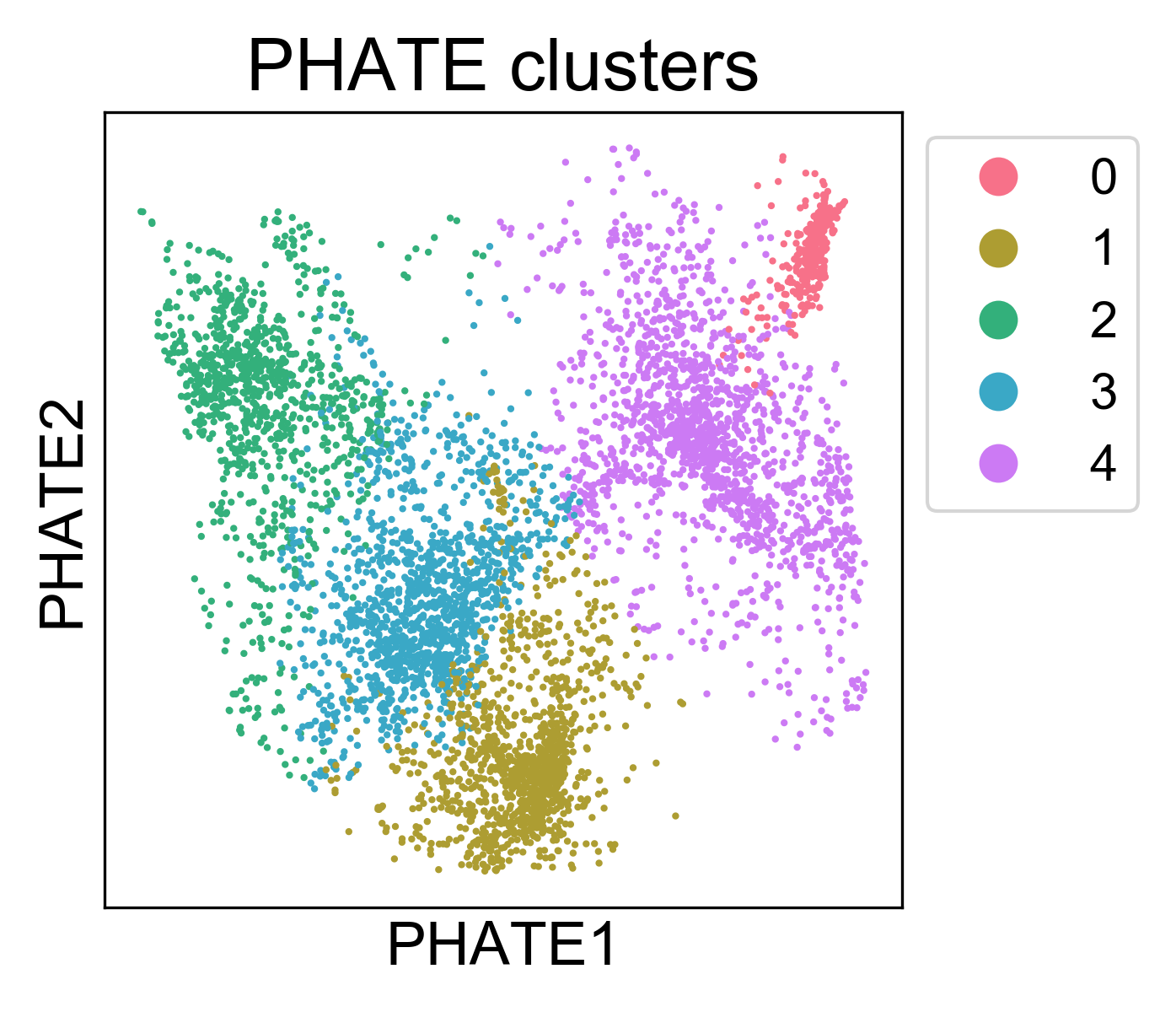
Here, we can see that the clusters are localized on the PHATE plot, and now we can begin to characterize them. Note, I won’t claim that this is the best method for identifying clusters. In general, cluster assignments should be seen as “best guess” partitions of the data. For every clustering algorithm, you can change some parameters and increase or decrease the number of clusters identified. The best way to make sure you have “valid” clusters is to inspect each group individually, and make sure you’re happy with the resolution of the results.